QOG Option tools includes three sections: Option Statistic, OI Change and Option Chain.
Option Statistic
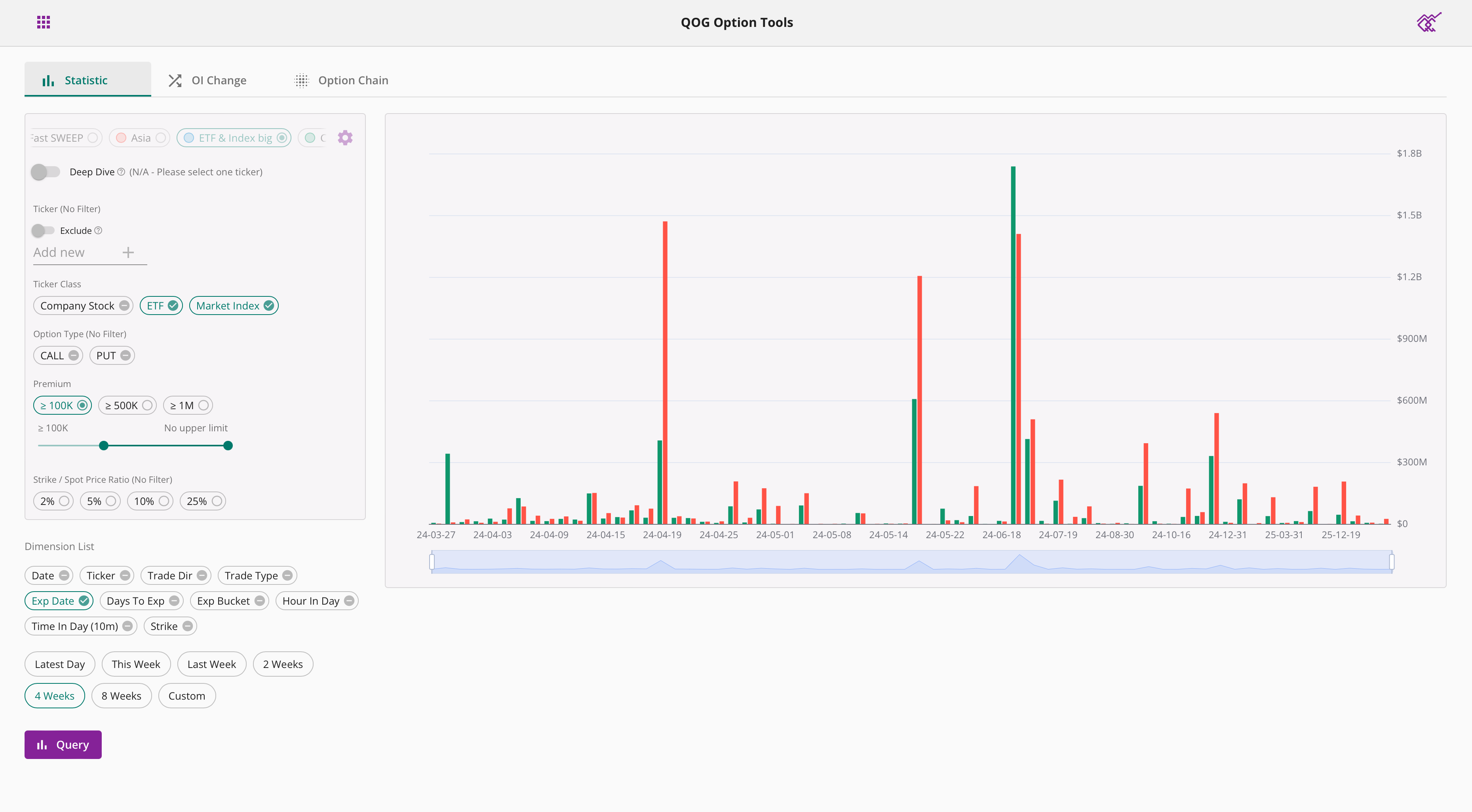
Options statistics help you summarize the different dimensions of option flows for stocks of interest, making it easy for you to understand the market conditions quickly. We use bar charts or tables to show the statistics, the higher the bar / darker the color indicates larger option order premium.
You can choose the time range you want to count, default time options include: last day, this week, last week, 2 weeks, 4 weeks, you can also customize the time range you choose. One year of historical data is supported.
About filter settings, please refer to Option Query tutorial.
You can include and display only the dimensions you are interested in for statistics. Different combinations of dimensions will give you different results, and not all combinations will be accepted. If your combination is invalid, an error message will be displayed. Below you will find examples of common dimension combinations.
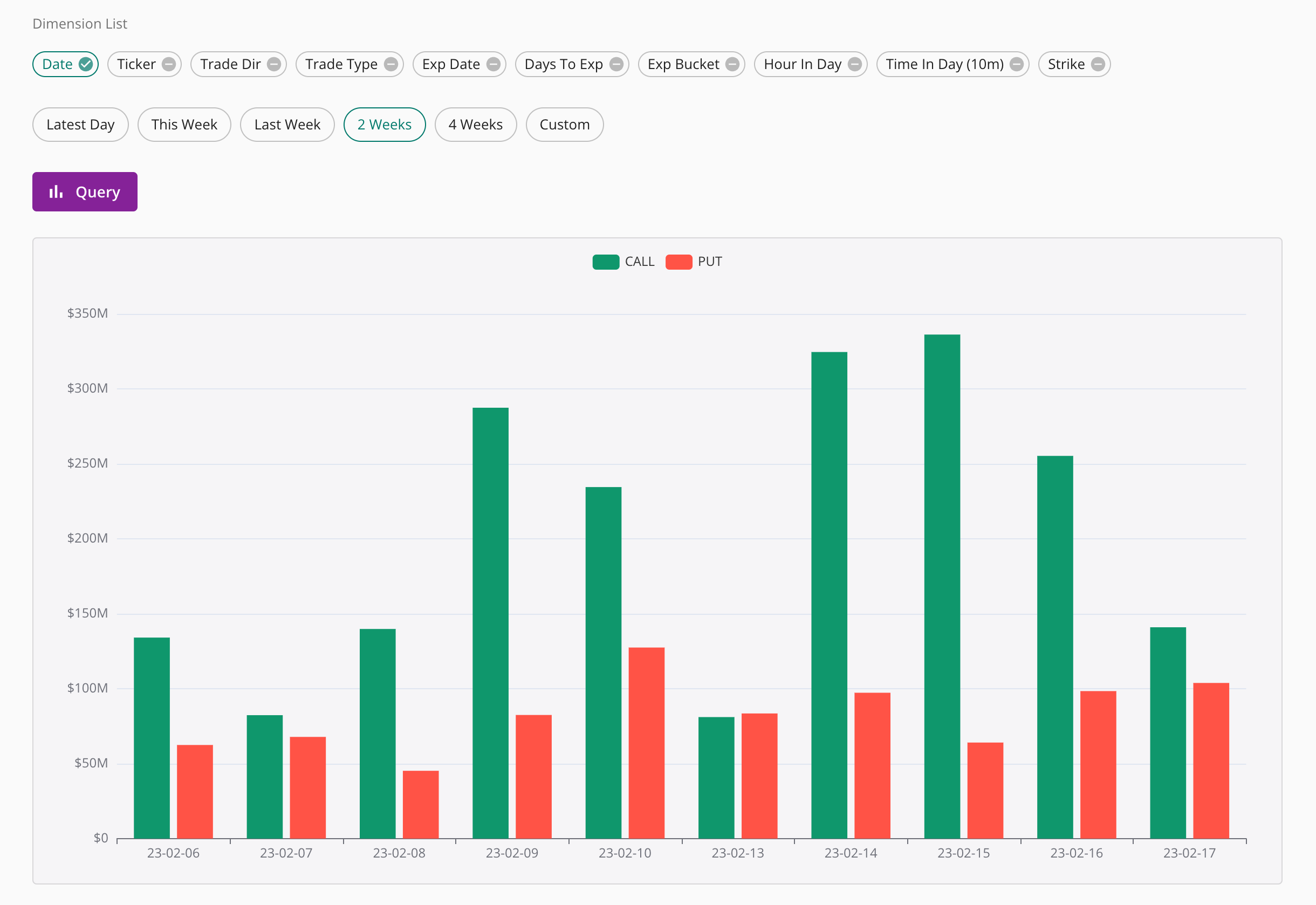
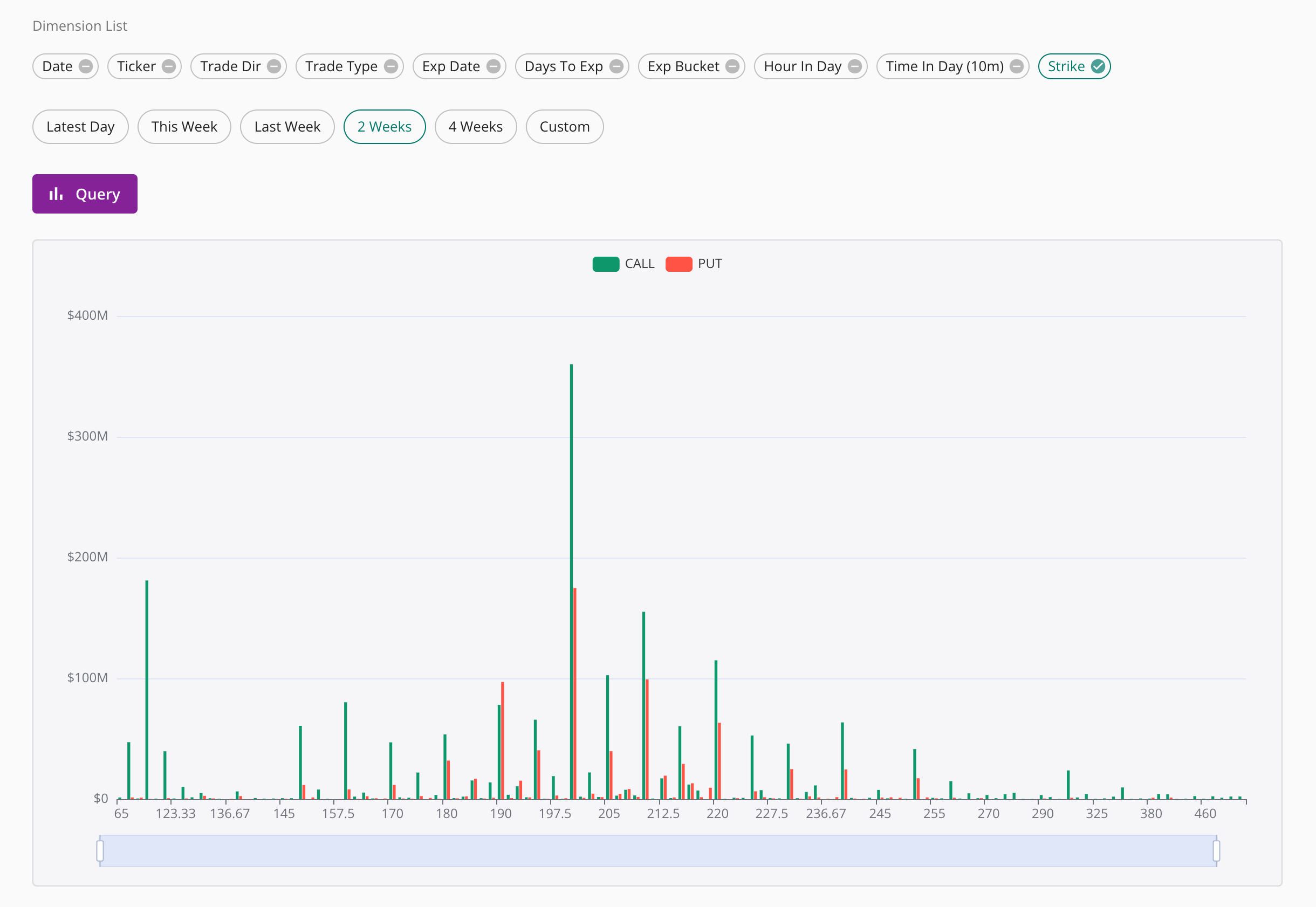
As shown below, setting a single dimension will display a bar chart based on that dimension's data.
As shown below, setting two dimensions will display statistical table based on the two dimensions.
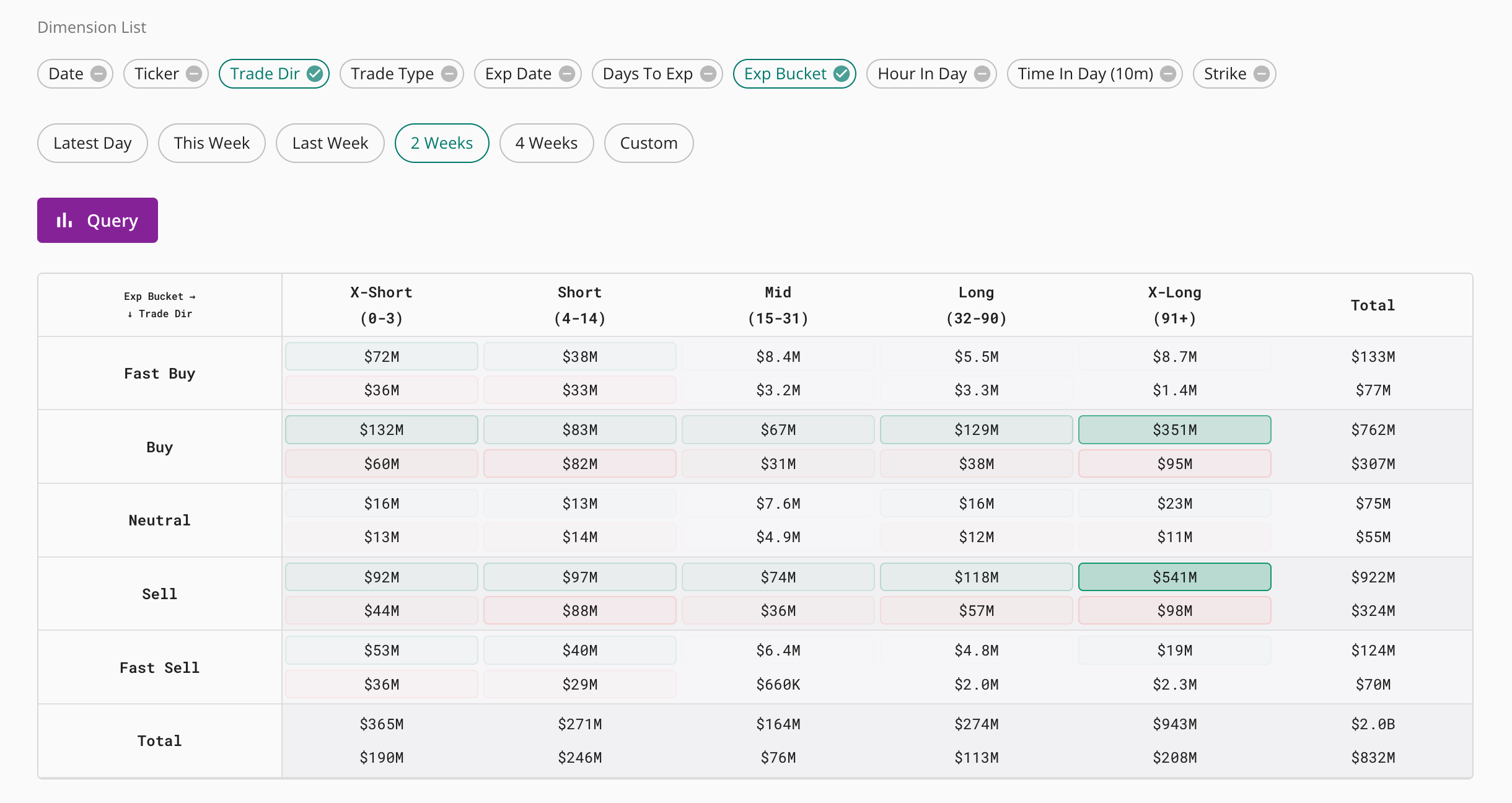
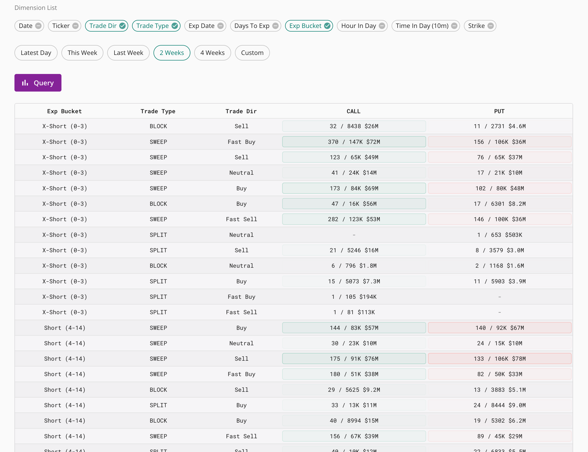
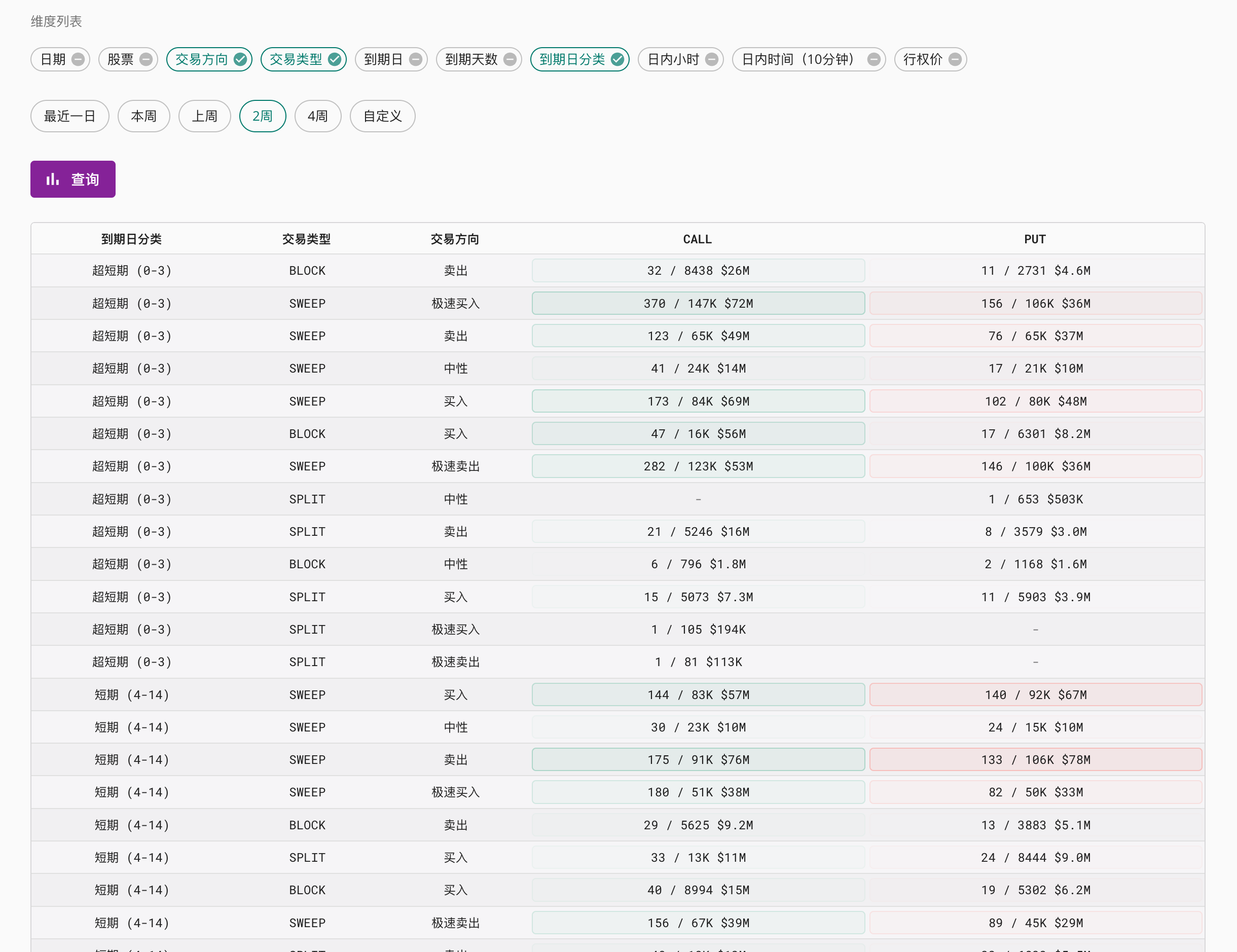
As shown below, setting three or more dimensions will display a table. You can click on the dimention titles to sort them.
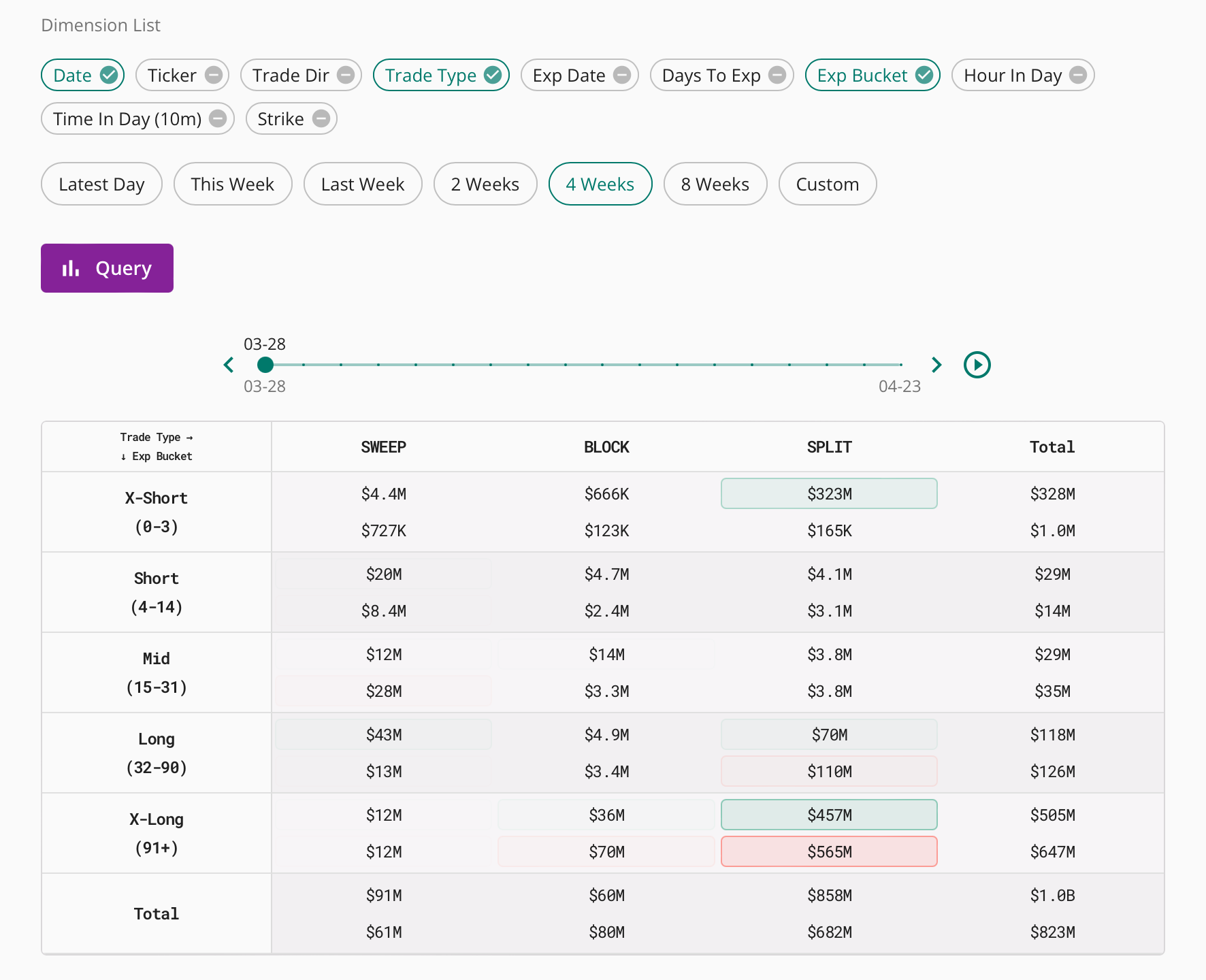
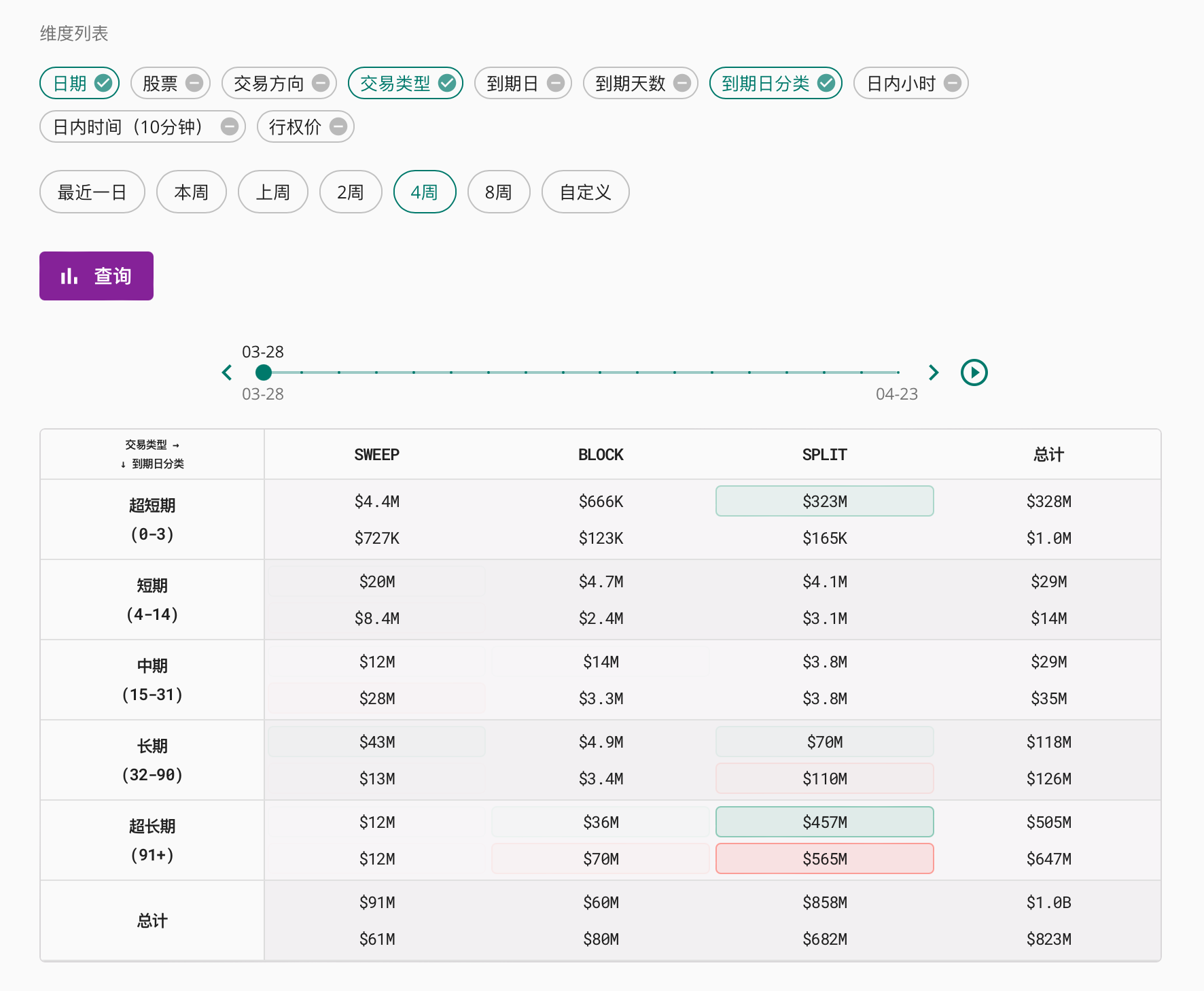
If the date is selected as a dimension, then the chart will have a timeline and you can drag the scroll bar to see how the data changes with the date. For example:
OI Change
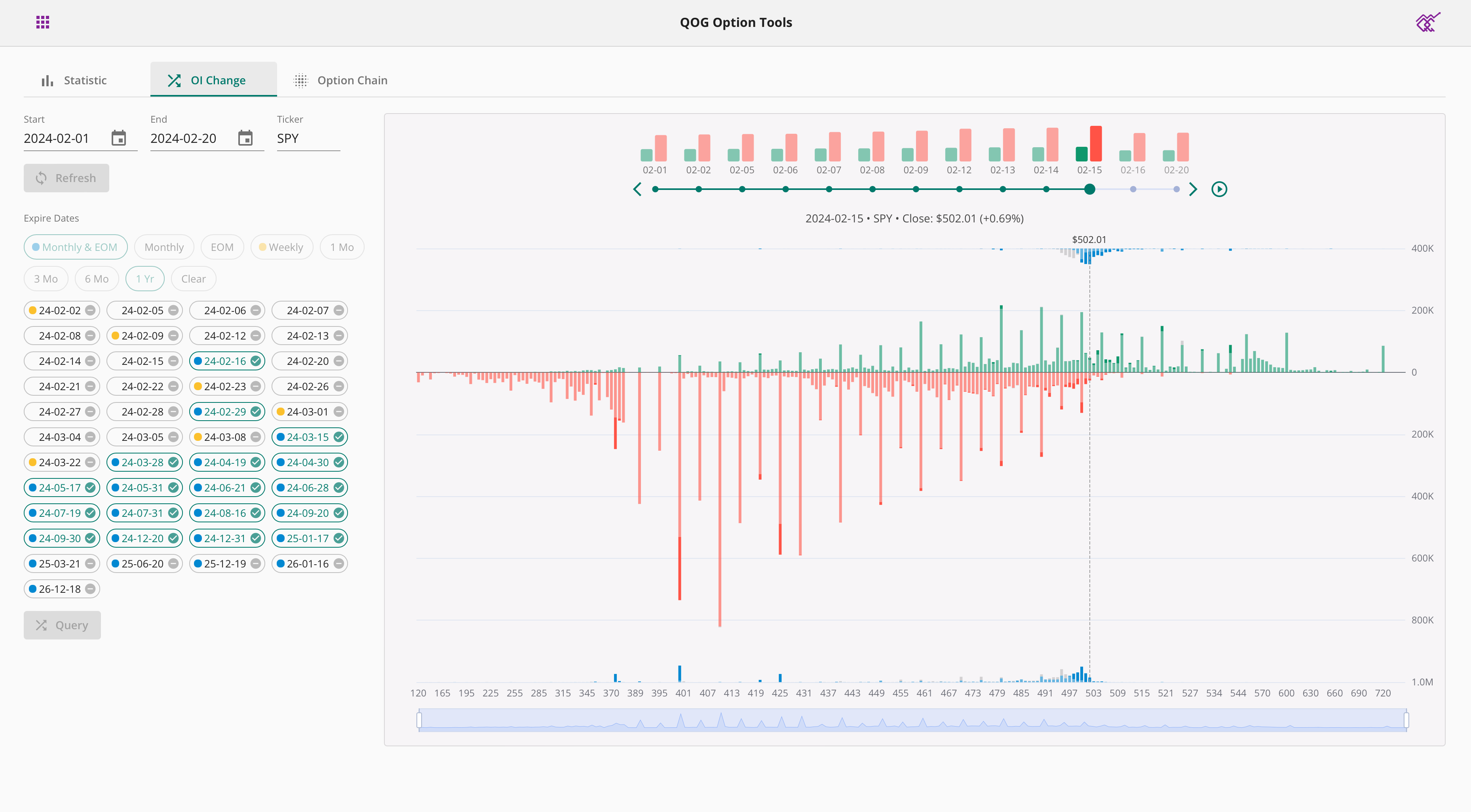
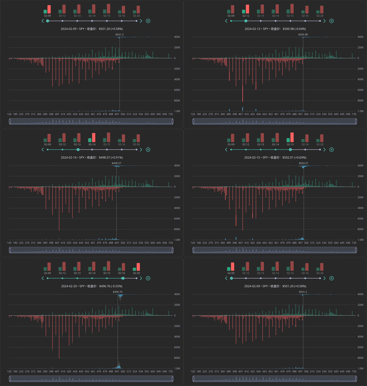
OI Change helps you track open interest and volume changes. One year of historical data is supported.
First select a date range and ticker, and then click Query to load the list of expiration dates. Select the expiration date of interest from the list of expiration dates, or quickly select matching expiration dates from the buttons above. Click the query button below again to view the OI change chart.
The chart is grouped by date and you can drag the scroll bar above to select the date you want to view. You can also click the play button to have the chart play automatically.
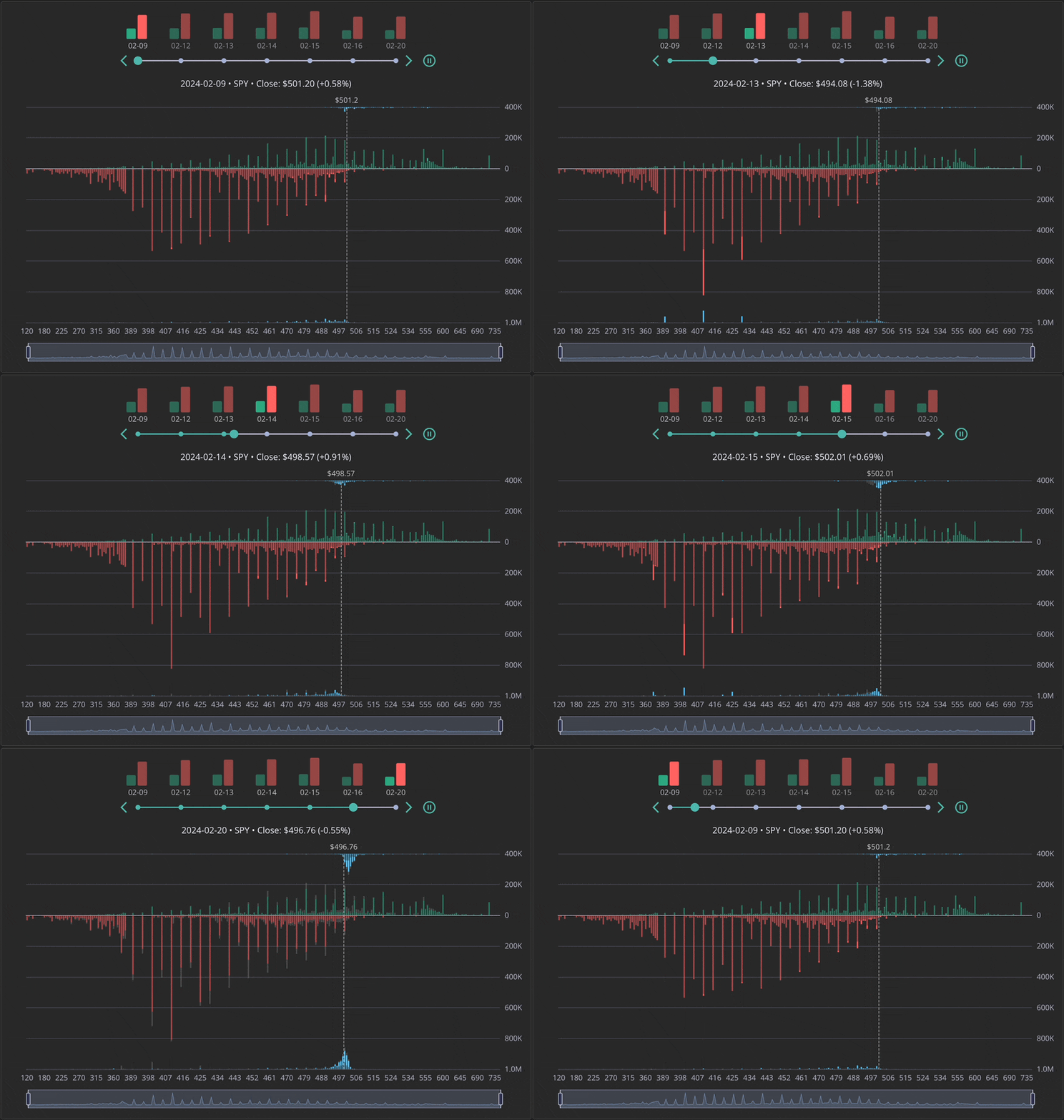
Please note: Open interest data is delayed and is usually available after the next trading day ends.
Option Chain
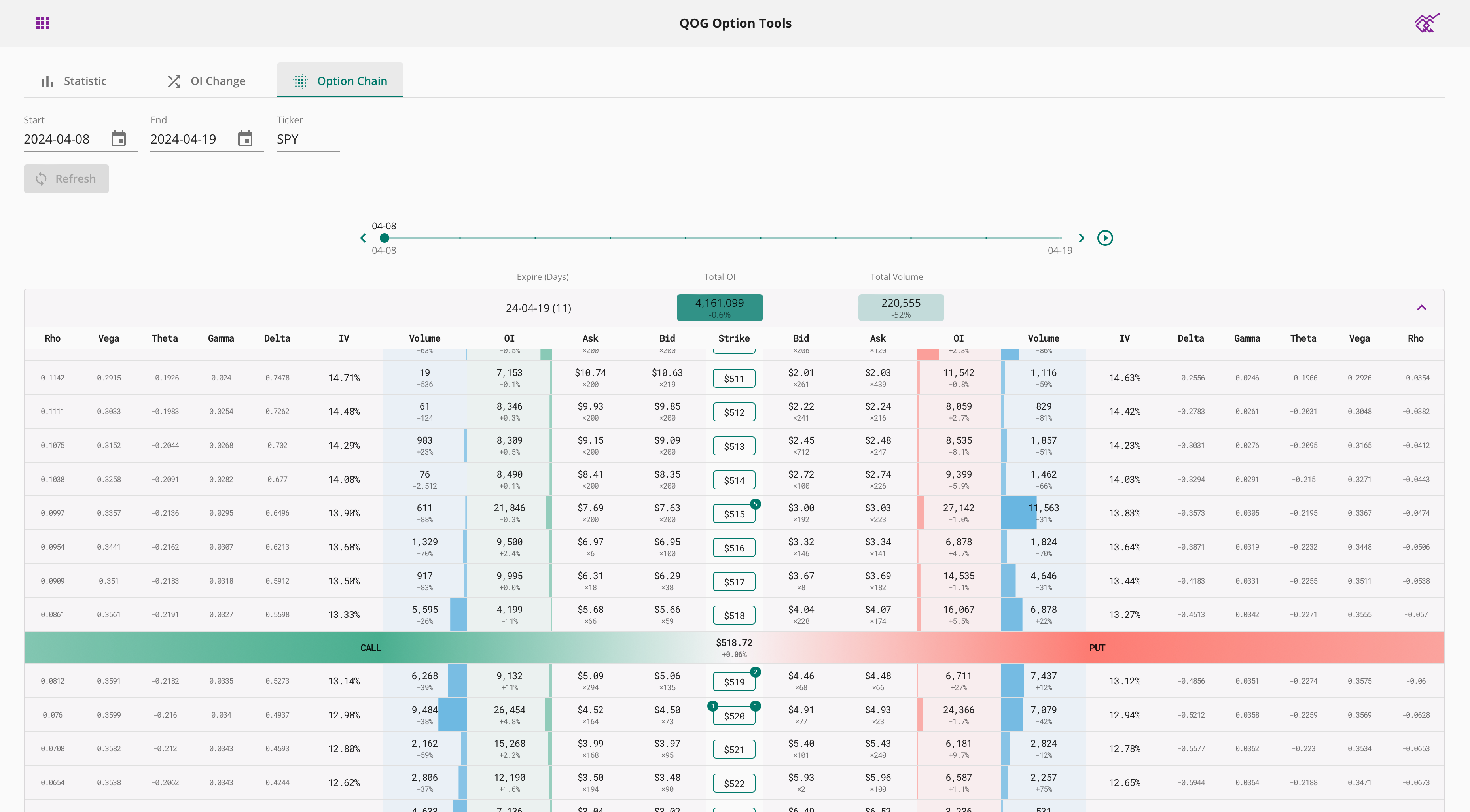
Option chain shows you the full option chain. One year of historical data is supported.
First select a date range and ticker, and then click Query to load the list of expiration dates. Select the expiration date of interest, and the option chain data for that expiration date will be loaded.
The chart is grouped by date and you can drag the scroll bar above to select the date you want to view. You can also click the play button to have the chart play automatically.
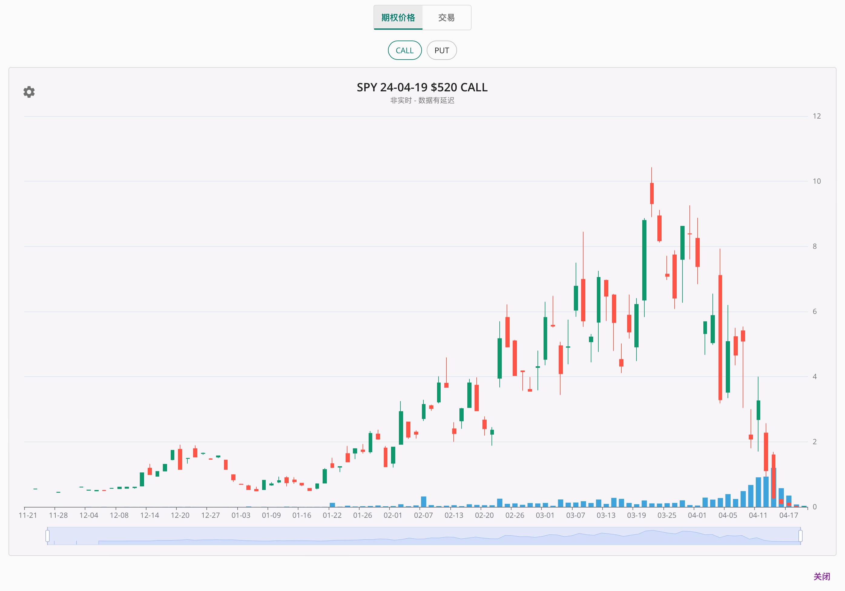
Clicking on a strike price will show you the option price history for that strike price, as well as the matched option flow data.
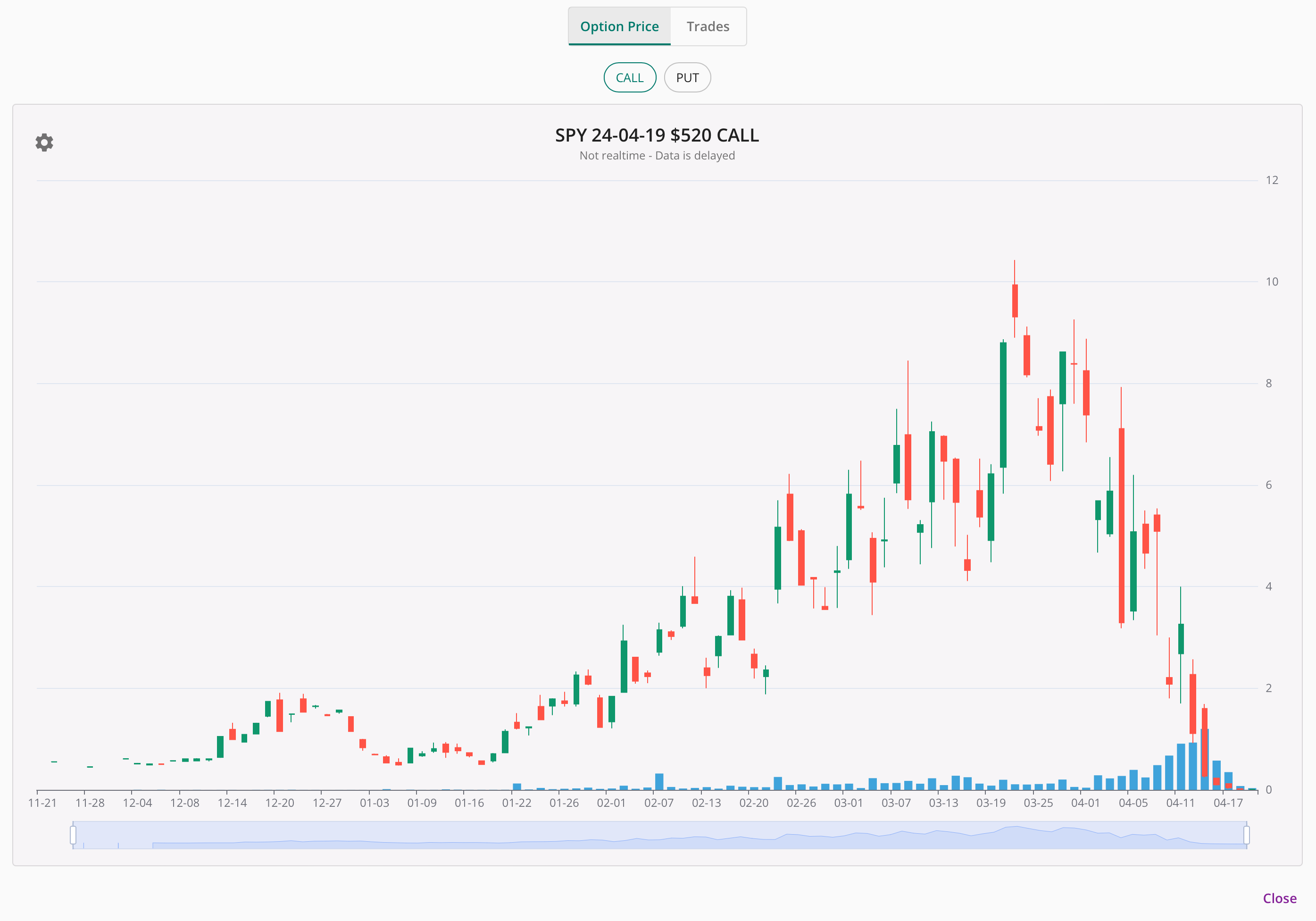
Please note: Open interest data is delayed and is usually available after the next trading day ends. Other data are usually available after current trading day ends.
QOG 期权工具分为三大板块:期权统计,OI变动和期权链。
期权统计
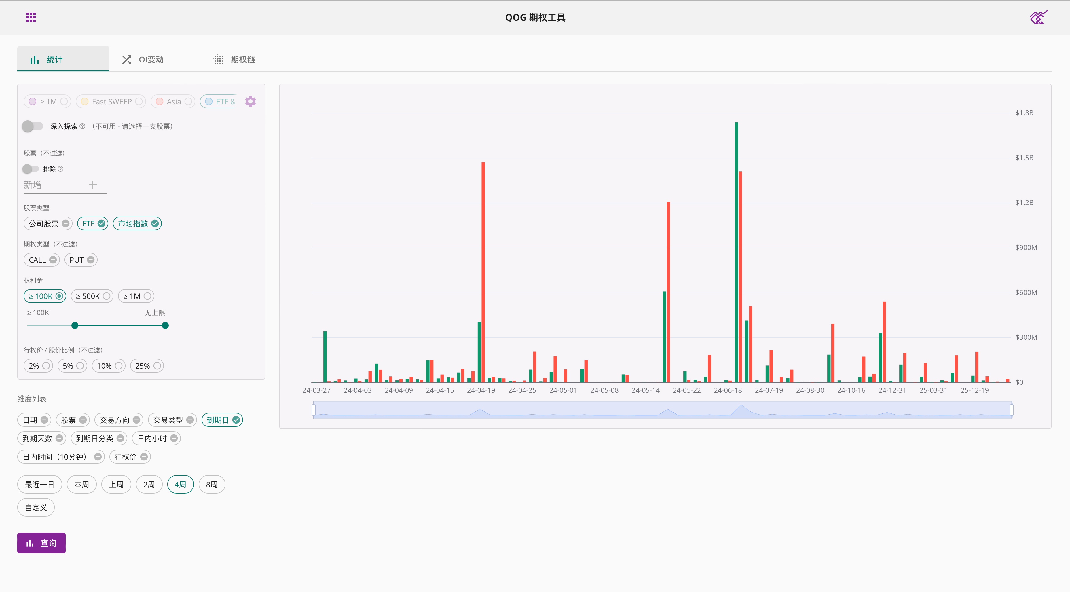
期权统计帮助您总结感兴趣股票的不同维度期权大单,方便您更快速的了解市场状况。我们使用柱状图或者表格来展示统计结果,柱子越高/颜色越深表示期权大单金额越大。
您可以选择想要统计的时间范围,默认时间选项包括:最近一日,本周,上周,2周,4周,您也可以自定义选择时间范围。支持一年期权数据的查询。
有关如何设置过滤器,请参考期权查询教程。
您可以包括并只显示您感兴趣的维度进行统计。不同的维度组合会给您带来不同的结果,并且不是所有的组合都能被接受。如果您的组合无效,将显示错误信息。下面为您举例常见的维度组合。
如下图所示,设置单一维度,将显示根据该维度数据的柱状图。
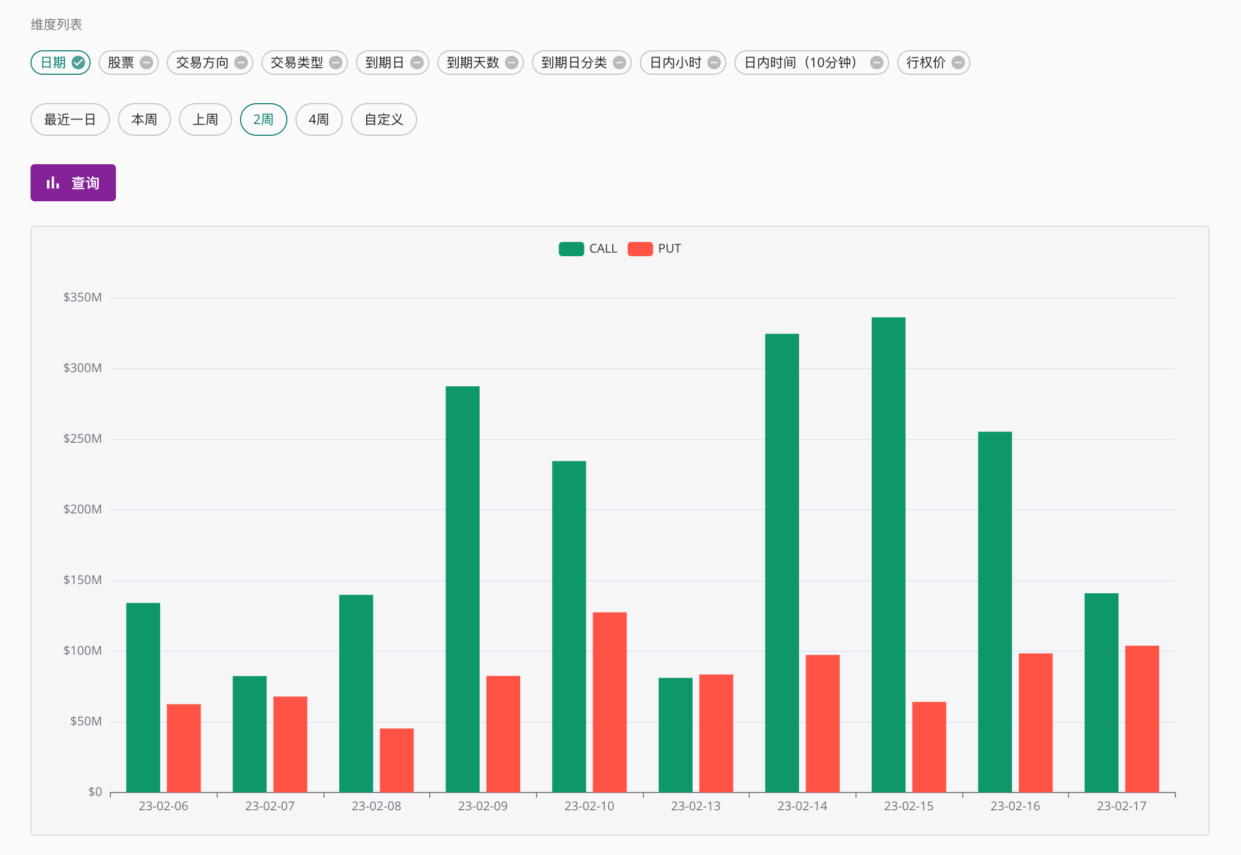

如下图所示,设置两个维度,将显示根据两种维度的统计图表。
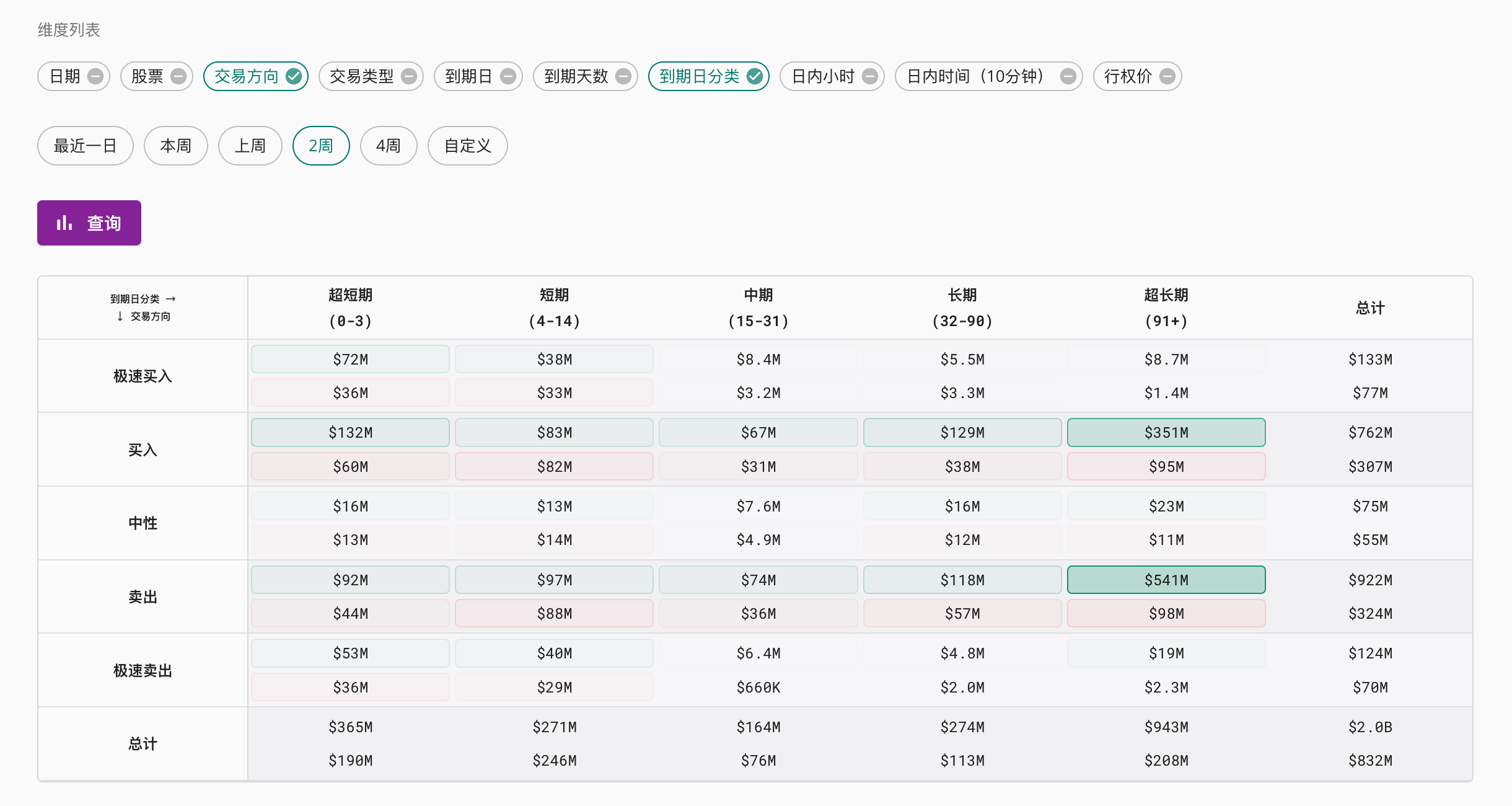
如下图所示,设置三种维度种类,将以表格形式呈现结果。你可以点击维度标题来进行排序。
如果日期作为一个维度被选择,那么图表将拥有一个时间线,您可以拖动滚动条查看数据随日期的变化。例如:
OI变动
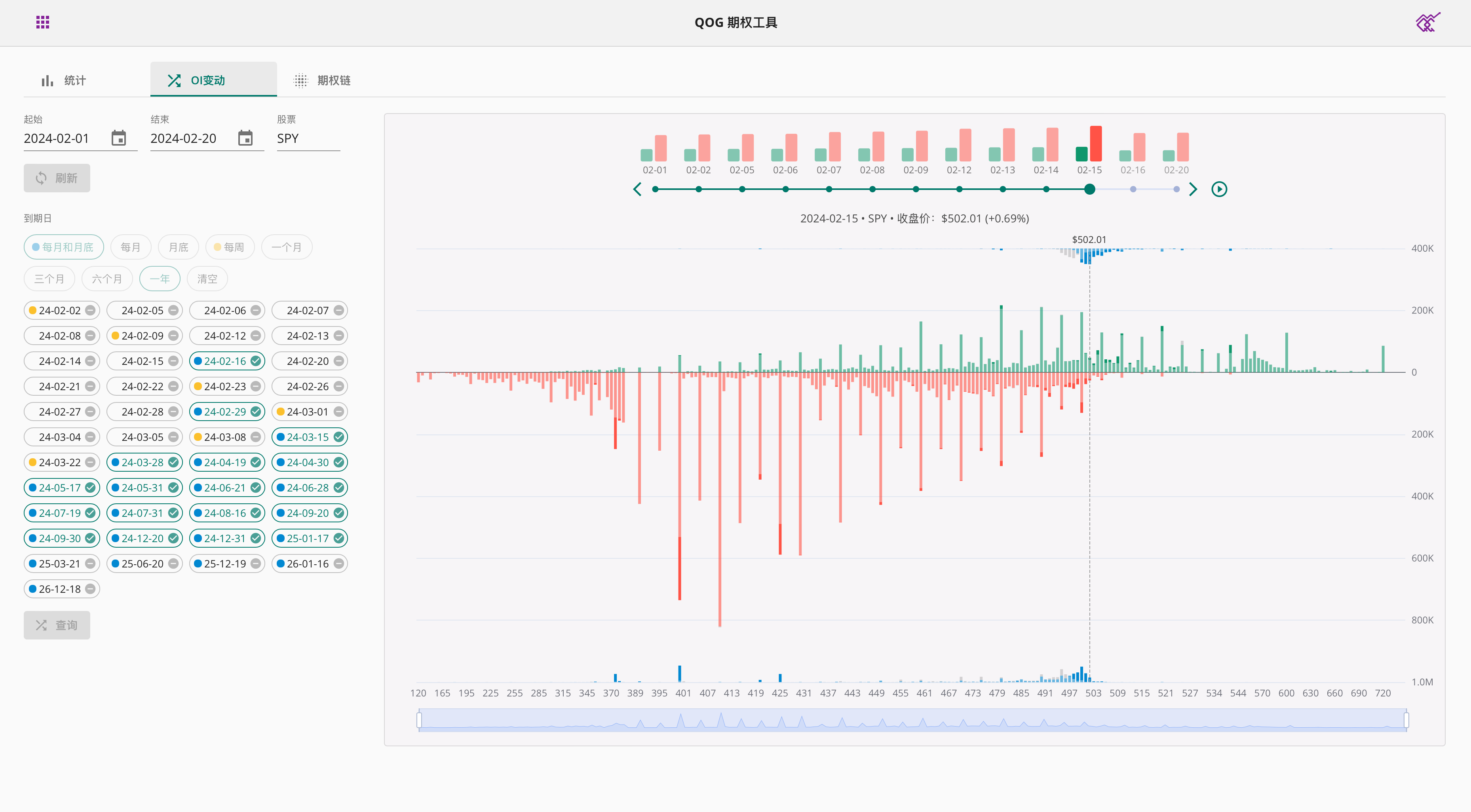
OI变动帮您追逐期权未平仓量和交易量的变化,支持查询过去一年内的数据。
首先选择一个日期范围和股票,然后点击查询便可加载到期日列表。在到期日列表中选择感兴趣的到期日,或者从上方的按钮中快速选择符合要求的到期日。再次点击下方查询按钮便可以查看未平仓量走势图表。
图表按日期分割,您可以拖动上方的滚动条选择想查看的日期。您也可以点击播放按钮让图表自动播放。
请注意:未平仓量数据有延迟,一般会在下一个交易日的盘后进行更新。
期权链
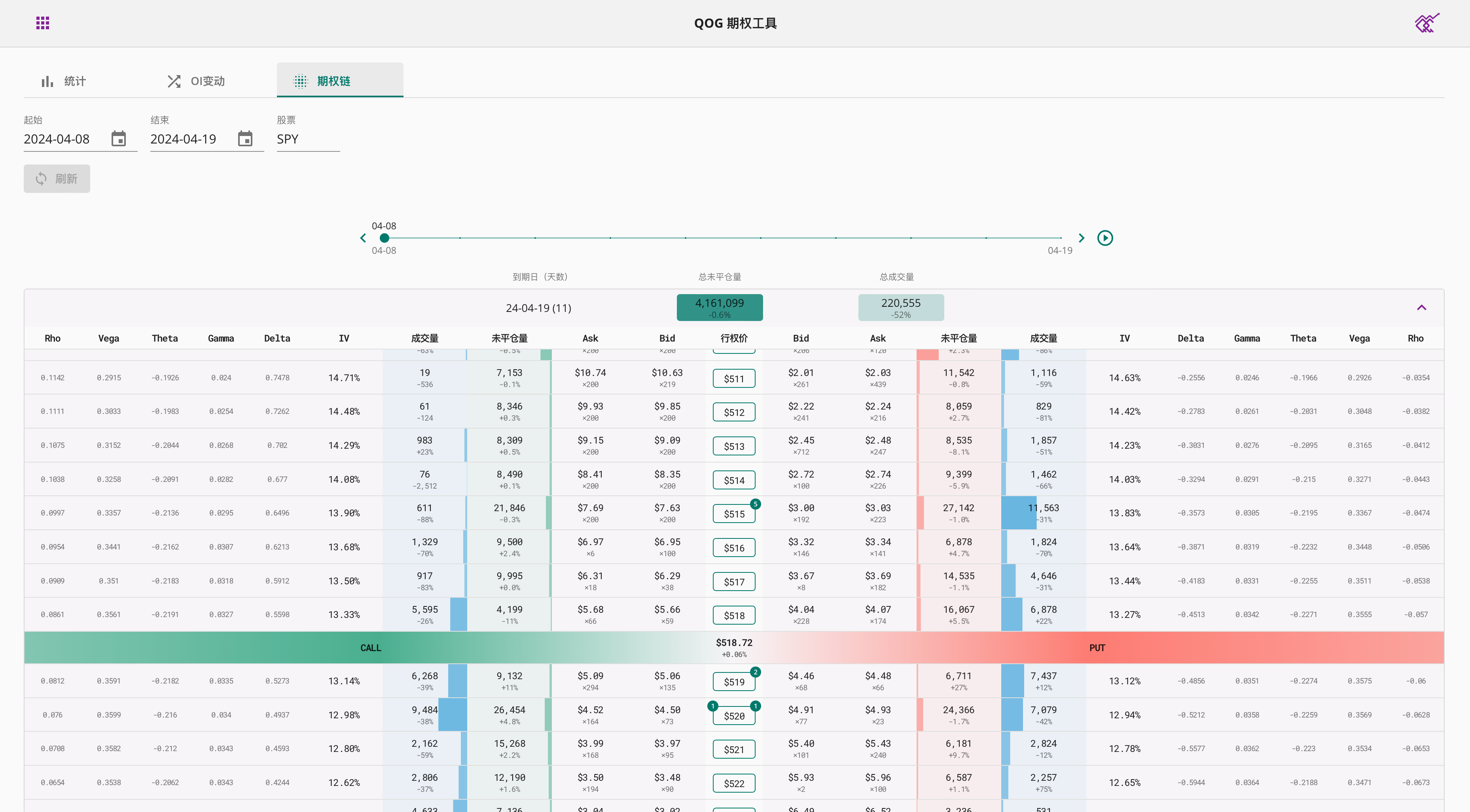
期权链想您展示完整的期权链,支持查询过去一年内的数据。
首先选择一个日期范围和股票,然后点击查询便可加载到期日列表。在到期日列表中点击感兴趣的到期日,便会自动加载该到期日的期权链数据。
图表按日期分割,您可以拖动上方的滚动条选择想查看的日期。您也可以点击播放按钮让图表自动播放。
点击某个行权价可以查看该行权价的期权价格历史走势,以及所匹配到的期权大单数据。
请注意:未平仓量数据有延迟,一般会在下一个交易日的盘后进行更新。其它数据一般在当前交易日的盘后更新。

